Premier Inn Brand Colour ‘Meeting WCAG 2.0/2.1 Standards’
Elevating accessibility compliance while strengthening brand impact.
Issue
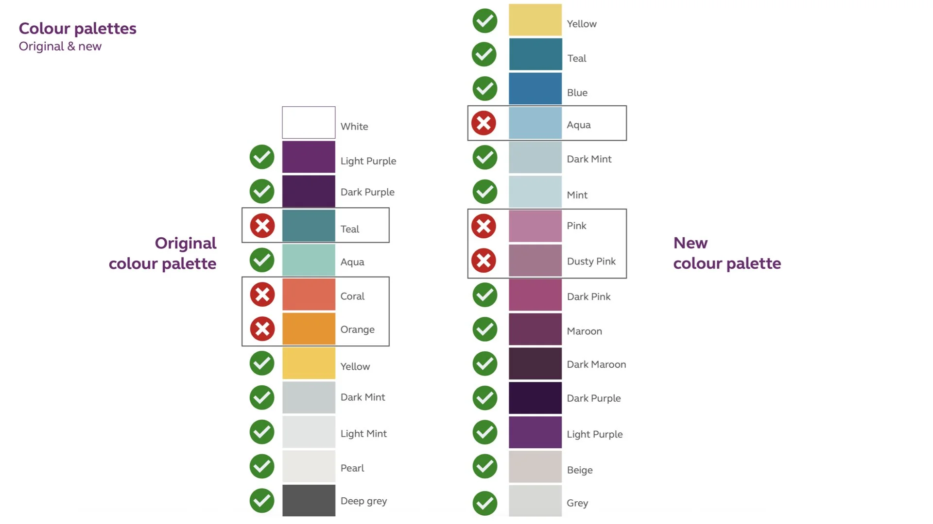
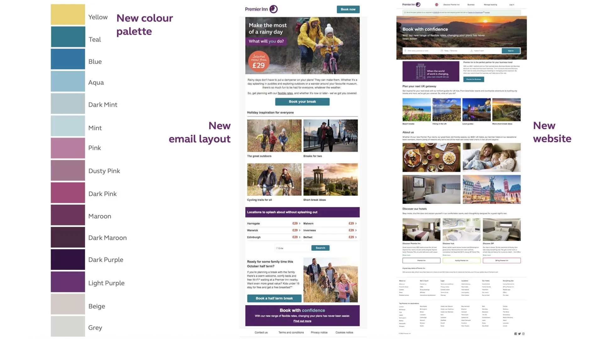
Premier Inn’s digital presence needed to match the strong brand recognition of its print and physical environments. However, with a new colour palette introduced alongside the existing one, there was uncertainty about which colours worked best for visibility, accessibility, and brand impact – especially in digital contexts like emails and the website. The challenge was to identify the most effective colours and usage patterns while ensuring accessibility compliance, clear hierarchy, and brand consistency across all customer touchpoints.
Insight
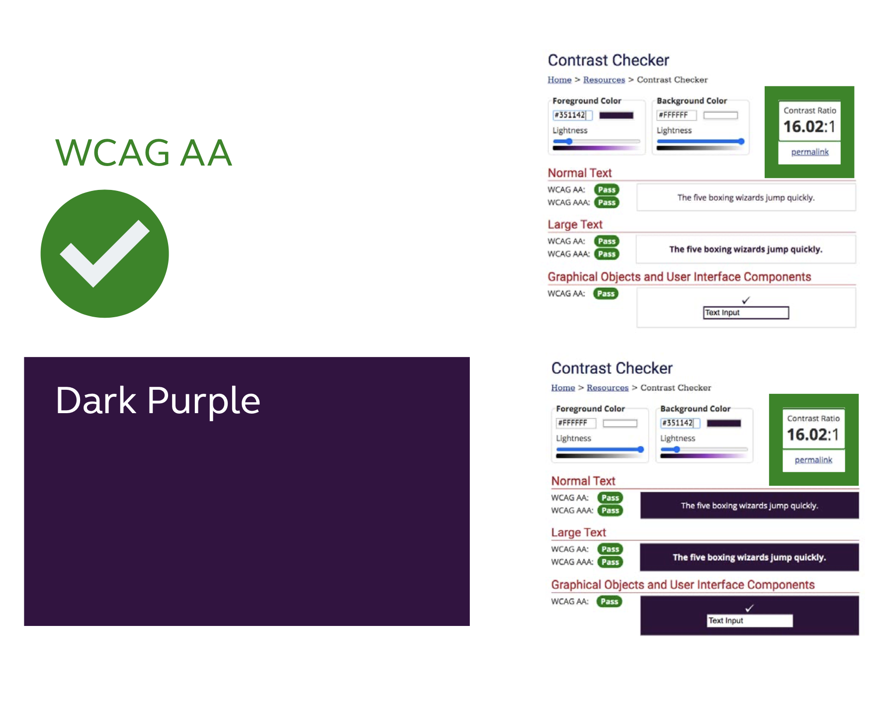
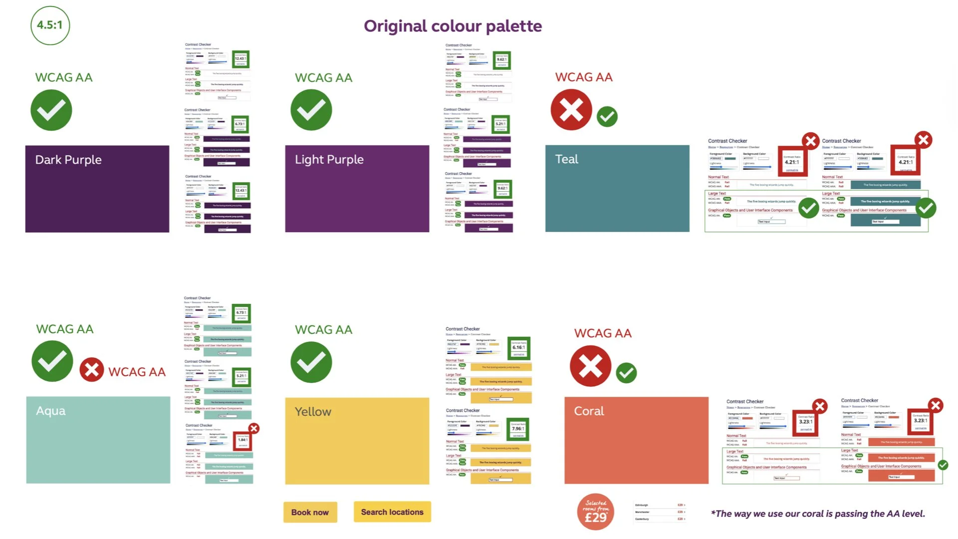
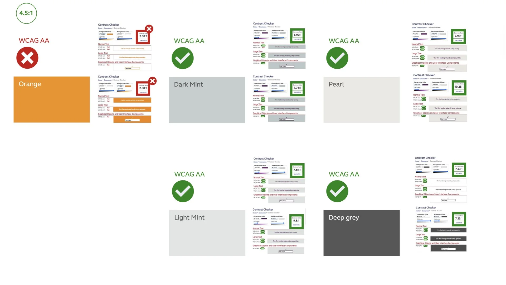
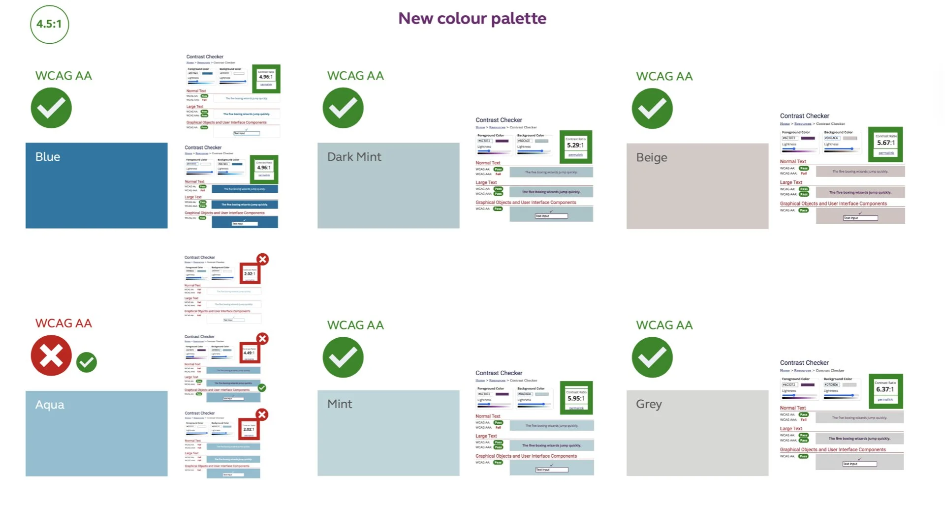
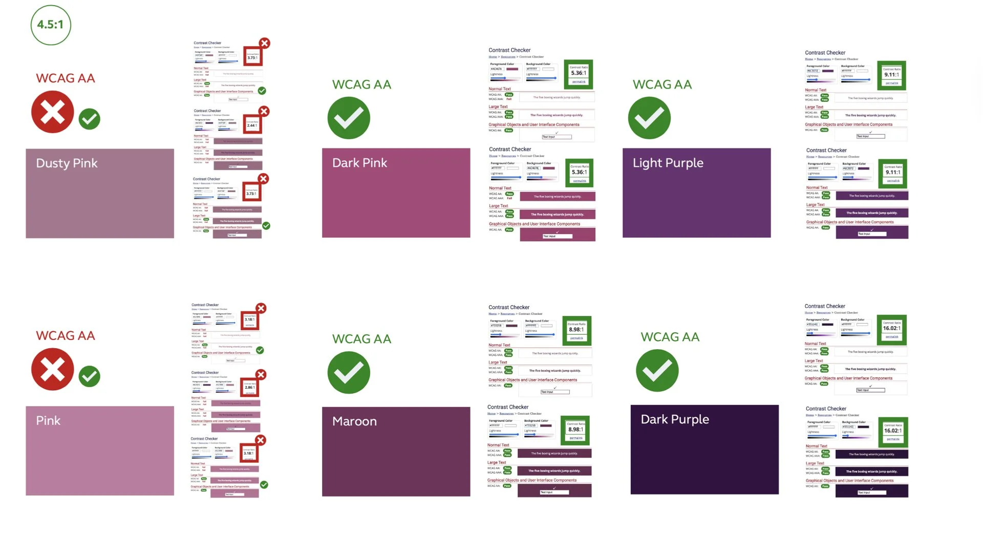
Brand recognition depends on consistent use of colour, but in digital design, colours must also meet accessibility standards (WCAG 2.0/2.1) and function well within layouts. Analysis showed that certain colours (like teal) strengthen brand recognition but could decrease CTA prominence, while others (like yellow) provide better visual contrast and engagement potential. The interaction between colour, hierarchy, and context – rather than colour alone – is the fundamental factor behind effectiveness.
Idea
We audited both the original and new palettes, reviewing usage ratios, accessibility scores, and live performance across email and web. We ensured contrast compliance, tested colours in context, and refined the CTA hierarchy for clarity. Recommendations included differentiating CTA levels, improving layout spacing, enhancing copy readability, and using high-contrast colours like yellow for key actions while applying brand tones strategically elsewhere. This data-led approach, underpinned by brand stewardship, kept Premier Inn’s identity clear, consistent, and engaging online.
Impact
The review presented a clear, evidence-based colour usage strategy that balanced brand consistency with digital performance. The findings supported accessibility compliance, improved visual hierarchy, and increased CTA prominence, resulting in stronger engagement potential in email and web campaigns. By aligning colour strategy with both brand and usability principles, Premier Inn could confidently adopt its new palette without risking recognition or effectiveness.